Just as a writer needs an outline, a painter needs a subject, idea, concept and a value plan before attempting a composition. In this landscape, I looked out my window and began to paint! Bad idea. I've run into problem after problem. This was the reason I've been trying to compose from memory. I want to have my idea, concept, subject and value plan in place before I start looking and copying things.
To learn to draw and paint you copy things. You learn to see. To compose a good painting you almost have to forget all of this or your right brain takes over and you start drawing and painting what you see or worse yet, what your left brain thinks you see.
When I copied the landscape by Joseph Alleman, I forgot to look deeply into it and analyze how it was done. I can copy a painting easily and think I've learned something and maybe the right side of my brain has but I have to make my left brain or my intellect come along! Tomorrow I'll go back and analyze the landscape I copied.
I think composition may be the skill of using both sides of the brain. You plan with the left side and paint with the right.
Saturday, October 30, 2010
Friday, October 29, 2010
Landscape 3

I'll attempt a landscape from the view out of my window. This time, I'll use a burnt sienna and cadmium yellow glaze under everything except the sky area. I'll mix burnt sienna back into the sky later but I want a middle value under the rest of the painting.
Another Landscape

In this landscape , I used cadmium orange watercolor for the initial glaze I'm much happier the second time using this method. I thinned the second coat of paint and didn't try to get the white to cover in one coat. This is a copy of a painting by one of my favorite artists Joseph Alleman. I don't know if he starts with an orange glaze. but I learned about breaking up color without the messiness of impressionism. This style fits my personality better.
Wednesday, October 27, 2010

Tuesday, October 26, 2010
The Kayaker

I darkened the face and hands of the kayaker. Notice how the whole composition is a series of zigzags. Now I'll post on ebay.
The Kayaker

Next, I'll add a glaze of blue to the yellows on the left gorge to push them back and some blue to the far kayaker to make him stand out from the yellows.
Monday, October 25, 2010
Kayaker

Today, I decided to do a little landscape. I composed this from some photos taken at Letchworth State Park where my husband and I went whitewater kayaking last weekend. It was a beautiful fall day. I decided to show the brilliant golden leaves on the right bank. To push the gorge back I decided to simplify with darker curving shapes on the left and center. I'll use zig zag shapes in the trees and in the water for harmony and movement.
Thursday, October 21, 2010
Blossom 2 Part 4

Off to Ogunquit, Maine for my anniversary weekend!
Blossom 2 Part 3

To gray the background area, I painted a thin glaze of alizarin crimson over it I added some touches of it on the inside of the glass.
Vincent's Blossom 2 Part 2

In my first glaze I used a thin coat of virdian, ultramarine blue and white for the background. I used an even thinner glaze inside the glass around the saved white areas. The line is cadmium yellow medium. It looks orange on my screen and in the painting. For the flowers, I used a thin coat of ultramarine blue and white. I outlined the flowers then blotted with a tissue. The stem and shadow are viridian and cad. yellow.
Vincent's Blossom 2 Part 1

For the next painting in this series I decided to change the flower shape to chicory. I changed my glass to a cut glass with the same shapes in the cuts as in the petals of the flowers.
Blossom in a Glass Part 4

My imagination is inspired from studying Van Gogh.
Wednesday, October 20, 2010
Blossom in a Glass Part 3

Blossom in a Glass Part 2

Tuesday, October 19, 2010
Blossom in a Glass Part 1

I decided to keep the flowers roughly in the same configuration. The picture felt more balanced with the lower flower on the right covering part of the darker area. I made sure to keep the forms of the flowers sharp and angular to stay with the idea of an angular composition while trying to suggest apple blossoms.
I originally had the stem disappear at the water level. The composition felt heavy on the right. I added the underwater stem as did Van Gogh for balance.
Monday, October 18, 2010
Looking at Blossoming Almond Branch in a Glass
I can't post this wonderful painting by Van Gogh so you'll have to google it. There are many versions online.
What is the subject? The almond branch, of course. The idea? I think that the idea is dominated by a strong vertical. This feels to me like newly awakened life from the dead of winter. The concept is a still life in the shape of a cross. This is an example of angular composition.
The warm red line anchors the composition. The vertical line is typically the strongest line in a painting. In this painting Van Gogh boldly made the horizontal line the strongest Why did he do that? The second horizontal is almost directly in the middle of the painting. A line most painters avoid. Imagine the painting without the red line. It will not compose withing the frame. The red line opposes and balances the whole composition. An extremely attractive solution.
Notice that the red is not only found in the line but relates to the painting in the flower and his signature. His signature is part of the design. He also used red to make the sumptuous grays in the background. Next take a look at how he spread the yellow and the blue through the picture. He used a warm yellow in the front with uneven rhythmical horizontal lines. He anchored the glass to the right side with dashes of blue indicating a shadow. and then cooled the yellow with a touch of green behind the glass. He seems to have followed a simple rule that many colorists use: to repeat a color at least three times. At first glance, we see the green as a compliment to the red on the branch. It is also in the glass and cooling the yellow. He may have used it in the grays of the background.
Van Gogh may have been an intuitive painter but intuition comes only after years of study and practice.
Friday, October 15, 2010
Where Do Ideas Come From?
When my husband was in college (back in the days of albums), he and his roommate had a "No flips rule." They took turns picking albums but no flips were allowed in a day. This was so they wouldn't get tired of their music collection. Well, I have violated the "No flips rule" with the color red! Time to move on.
I had a vague idea that I wanted to create an angular composition because I have been working with circular composition which I'll explain in detail at a later date.
I decided to use Van Gogh's Blossoming Almond Branch in a Glass for inspiration because I LOVE it. Google it to see what I'm talking about. It has an angular composition. It has a generous amount of white paint and I want to overcome my fear of white paint. Of course, I'll change the red line.
Will it generate a series? It did for Vincent. He painted twelve paintings from this idea. I have an advantage; I already painted four paintings of fruit blossoms before I studied composition that I want to recycle. I'll try for four still life paintings with angular composition using fruit blossoms.
Vincent Van Gogh copied the masters often. I think he would be proud that he has taught me so much. Now that I have generated a good idea for Monday, I'll take the weekend off.
Grasshopper Part 7

Well yesterday, I gave up too early. My husband came home and looked at my painting and said that it didn't look finished. He couldn't see the grasshopper from across the room. I am not my own best critic. It helps to have another pair of eyes.
Thursday, October 14, 2010

Grasshopper Part 5

It was too dark underneath the grasshopper because I kept painting too long yesterday and didn't think before I leaped. I scratched as much of the dark as I could.
Now, to solve this painting I want to move the eye around in a circle. I have been working in Circular Composition. I want to leave secondary interest areas in the upper left and upper right to complete the circle, give the suggestion of fallen leaves and keep my grasshopper as the focal point.
SUBJECT, IDEA and CONCEPT
A good habit to get in to right from the start is to look for the SUBJECT in every painting that you look at. You will usually find it using the Rule of Thirds: divide the painting into thirds vertically and horizontally. The subject is usually placed at one of the intersections. It is a good idea in the beginning to use this placement for your subject too. There are so many things to consider when constructing a painting let's leave the tricky stuff for later.
Next, try to figure out what the artist's IDEA about his subject is. How the light falls on an object is a very popular idea in contemporary realistic art. Feel free to use others such as gloom- I would use dark muted colors, dominant horizontal lines and heavy shapes. Line, color, and shape are your tools. Use them to express an idea.
A great example of a strong idea is Edvar Munch's The Scream. That's an IDEA.
Once, I used the idea of space. I tried to put as much space in a small canvas as I could cram. I used a hilly landscape so that I could use undulating, curving lines with many vanishing points stretching into the distance. I used a snowy landscape so that I could use cold colors because they felt expansive to me. Other ideas are: passion , humor, action, calm, peace, hot and humid. Think about what types of line,color, shapes you would use to paint these ideas. Use your own creativity. Chances are others will have similar feelings about your choices.
The CONCEPT is my plan of attack: landscape, figure in a landscape, still life, figure, interior, complete abstraction or combination of real subject in abstracted setting and any other style you can think up. In my example above my subject was less important that my idea and concept. My subject happened to be a barn. I put it in the upper right third to add to the sense of space.
You see how all of this can get a bit tricky. Sometimes you have the idea and concept first and the subject is incidental. This is the case a lot of the time in landscape. I had a hard time understanding subject in landscape especially impressionist. I've learned to look for it using the Rule of Thirds. The subject should be the most attractive item in the painting. This is where you usually find the darkest darks and lightest lights. Faces are very attractive so be careful when using them to decorate your picture if they are on other figures other than your subject. The eye is attracted to objects with uneven, irregular shapes. Sameness is boring in composition. The subject can be what the painting is about but usually in landscape it's just a focal point or a point of attraction that says: "Come on in and look around." Many successful landscapes are about Ideas.
Try to get in the habit of thinking Subject, Idea, and Concept before you design your painting for stronger results.
The Slinky Theory
Picture a giant Slinky. Imagine that the Slinky is stretched to infinity and you are climbing it. In the beginning, the spirals are wound tightly together and the climb is pretty easy. Then, the Slinky begins to stretch out. This is my experience of creating art. Sometimes I'll be climbing along and the path will get steep. I get frustrated and uncomfortable. I start thinking that there is something wrong with me. There have been many times I've thought that I could just quit. Then, I come to my senses and think " If I quit today, how do I know that tomorrow with just a little more effort, I might make something beautiful?"
It helps that I am crazy about art and have been since my earliest memories. In the beginning, I just wanted to get paint on paper or canvas. Soon, I realized that it would be helpful to learn how to draw. Drawing on the Right Side of the Brain is the best way to learn this. But where to go next? This is where the Slinky began to stretch out. I studied color. leaned to understand pigments, edges, perspective, The Golden Rectangle and many books by artists showing their process. All of this is helpful, even necessary in realistic art. I wanted something to set me free to create my own process.
I wanted a book like Drawing on the Right Side of the Brain that taught me to see as an artist. What makes a good painting? Two years ago, I found Pictorial Composition by Henry Rankin Poore. I've been studying it ever since. It was written in 1967. The language is difficult but it still is one of the best tools I've found to help me learn to think like an artist. My other help has been from Picasso, O'Keefe, and Van Gogh. I have books of paintings by these masters of composition and when I'm lost, I look to see how they have solved the problem I'm facing in the painting I'm attempting.
I've learned that there is a language in painting. If you learn the language, it will set you free to create in your own style.My goal is to find a way to make these rules understandable in a fluent, organized way.This blog is my attempt to compress some of the rungs on the Slinky of Art for you.
Wednesday, October 13, 2010
Grasshopper Part 4

I've run out of gas for today so I've decided to stop here. I've covered all of the red areas with cadmium yellow and darkened the red in the upper, right middle section. I'm trying to get an interesting dark and light pattern. I'm hoping that my invented leaf shapes look like the real thing. I think I'll go collect leaves.
Grasshopper Part 3

Why did I paint the first wash with red and yellow instead of blue and yellow as I did in the honeybee? If you look at the color wheel you can easily see that orange is between yellow (warmer) and red (cooler). If I put blue underneath orange,it will turn gray. The red will cool the orange ( move it back in space) without making it dull.
Grasshopper Part 2

I colored in the darks and lights and curved all of the pointed ends of the leaves toward the grasshopper. I made sure the corners are dull and the darkest dark and lightest lights are in the center of my composition and are interesting irregular shapes. I used curvilinear shapes for movement.
Grasshopper Part 1

I decided paint another insect and found a photo of this cute grasshopper in the WetCanvas Reference Photos. WetCanvas is a website for artists.There is a great reference library there where artists share photos for other artists to paint without worry about copyright laws.
Next, I decided to move up the rainbow to orange and decided to put the grasshopper onto fallen orange leaves. I filled the composition with maple leaf shapes remembering to point them toward my subject.
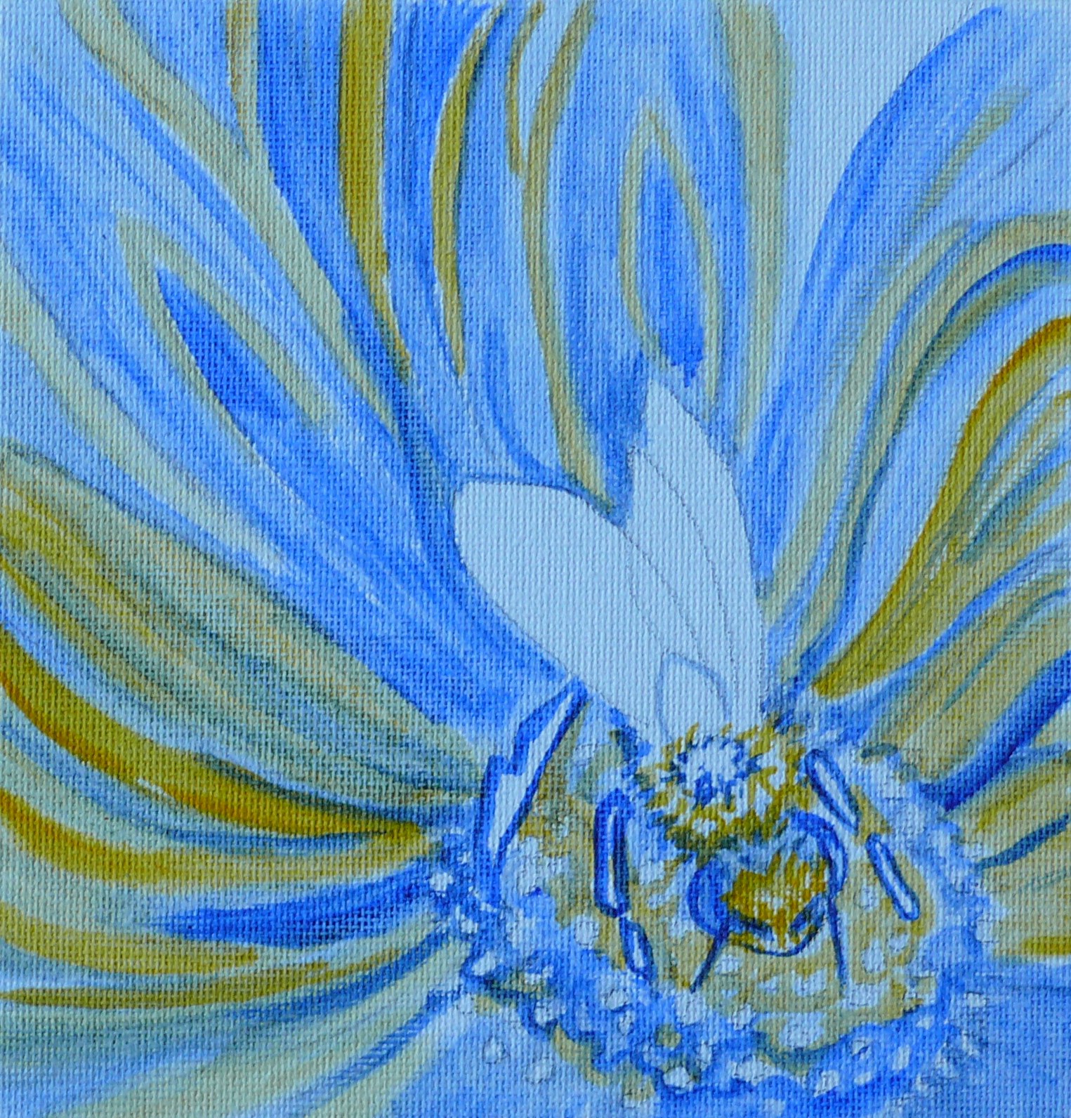
Honeybee 3 Part 6

Hooray for oil paint! Yesterday, I ran out of gas and gave up on this painting. This morning, I realized I had let go of too many whites. The area behind the bee was too dark. It felt like it was sucking the bee into the painting instead of showcasing it.
I lightened up many leaves taking care to point them toward my subject the bee and make them curvilinear to add movement. I lightened flowers in the upper part using aerial perspective - when things get farther away they get lighter and bluer. Since I'm working in red, I made the red lighter and more blue than the area around my subject which I want to emphasize.
Tuesday, October 12, 2010
Honeybee 3 Part

After I filled in all of the reds, I made sure to lose edges of the flowers around the edges.See how they blend together as we move away from the bee? Then I used the lines in the flowers to point toward the bee.
Honeybee 3 Part Four

I thought it would be helpful to show layering the cadmium red and alizarin crimson. I carefully applied the alizarin around the shape of the bee. Slowly, I picked out leaf by leaf moving out from the bee preserving some of the yellow for highlights. I like to leave more than I will need and adjust them at the end.
Honeybee 3 Part Three

I worked carefully with ultramarine blue and cadmium yellow underpainting. I wanted the darkest darks and lightest lights around the bee. Then I tried to move to the flower next to the bee. I want darks and lights but not as much contrast as in the bee. I moved on to the flower in lower left then lower right. I kept some yellow in the upper flowers for variety.
Saturday, October 9, 2010
Honeybee 3 Part Two

I filled the large circles with petal shapes making sure to add variety to shape and size. Next I colored them in adding dark and lights to move the viewers eye through the composition. I made sure that the darkest darks and the lightest lights are next to the bee, the subject. My eye travels from the bee to the flower nearest it to the flower in the lower left, next lower right. The exit is upper/middle right.
Honeybee 3 Part One

In today's composition I placed the honeybee in the upper left and decided to make it look as if it is landing on a flower. I decided on gerbera daisies again because I like to repeat shapes throughout the composition. Daisy petals harmonize with the wing shape of the bee and I can move them through the picture frame with variety using curvilinear lines which give movement. I want red to dominate this picture again.
Notice that I have filled the picture with various circle shapes. This will give me the guidelines for drawing the flowers with variety. I'm making sure the four corners are filled with an area that I can dull to make it less attractive. I'm making sure that my flowers intersect the edges of the composition at uneven intervals.
Friday, October 8, 2010
Honeybee 2 Part 5
 | |||||
This is only my third oil painting. For the past six years I have painted exclusively in watercolor. I love oil because when you use white paint as I had to do to change the highlights on the bee's legs, it didn't ruin the painting! I am still approaching the painting process as I would a watercolor and leaving the white areas as blank canvas. This seems to be working well. To finish the painting, I covered the blue areas with cadmium red. I added alizarin crimson (dark blue red) to the petals in the back and front and the crevices between the petals. I worked very slowly on the bee to get it to stand out. I decided to change the highlights on the legs to the outer edge to get the bee to stand out from the flower. I also added white around the body shapes for the same reason. |
Thursday, October 7, 2010
Honeybee2 Part Four
My first wash is ultramarine blue and cadmium yellow painted very thinly. I'm attempted to move the viewers eye through the picture. Notice how blue dominates in the lower right front. Yellow dominates in the middle distance and moves to blue dominating in the farthest petals. Even though this distance is only inches in reality, we want to make our composition have a lot of space.
Honeybee 2 Part Three

I've colored in my values leaving light in the darker areas in the back for variety.I've left two V shapes -upper left and right one of these will be the exit.
When I walked across the room to view this I notice that my values in the mid-lower right and left are too light. The bee doesn't read from across the room. I'll darken them before I paint.
Notice how I've tried to engage the edges. In this composition as in the last one I'm worrking with curvilinear shapes to give movement to the composition.
Honeybee 2 Part Two

I've repeated the wing shape with the daisy shape to fill the frame making sure to vary the size of both the petals and the spaces between for variety. Notice how I guarded the corners. I filled them with the petals. These petals also point back to my subject.
I decided to fill the circular shaped center with various irregular shaped circles for both harmony and variety.
I've left several V shapes on the outside edge. One of these will allow the viewer to exit the painting and I'll fill the rest in with a blue/red to show distant petals.
Honeybee 2

I've decided to a companion honeybee piece for today's painting. I loved the shapes in this drawing and the feeling of a bee at work. I decided to put the bee in the center of a flower. I drew the circle for a flower center and this suggested a daisy. I want this painting to be red again so I decided on a gerbera daisy because I've seen them in red.
I made the circle this small to provide for the bracket shape in the right lower corner. I'm hoping that I can dull this area to keep the eye out of the corner.
Wednesday, October 6, 2010
Honeybee Part 7
 | |||||
| In the final wash, I blended the front edges of the flower white, cadmium yellow, and cadmium red. I added some alizarin crimson at the bottom of the petal to make it curve. Next, I cleaned up the top edges of the petals by running alizarin crimson next to the white on the inside of the petal and then blended this in the direction the petals in the back are flowing. To darken the edges of the petals in the back of the flower, I added cadmium yellow. This is darker than the yellow/ white edges in the front so it appears farther away without adding black which would dull my flower. I added small amount of viridian (green) and ultramarine blue to white and filled in my piece of sky for an exit. How do I know when a painting is finished? When I started this painting I started with a SUBJECT - honeybee. Next, I needed and IDEA- the movement of the bees. I designed a CONCEPT ( a shape into which I can arrange my subject(bees) so that they looked like they were in the middle of bee activity. The curvilinear lines suggest graceful movement. When I've met these objectives. I know the painting is complete. |
Honeybee Part 6
 |
| The next step is covering the blue and yellow glaze with cadmium red. I added alizarin crimson to the cadmium red in the lower corners, back and center of the flower to darken them. Alizarin crimson is a darker, bluer red. Adding the darker red pushes these areas farther away. The bees were painted in cadmium yellow with small touches of yellow ochre and the stripes that appear black here are actually ultramarine blue and viridian (green). The reason I did this is because green is the compliment of red ( the color opposite on the color wheel). This sets up a vibration between the two areas. |
Honeybee Part 5

I decided to paint a red tulip. In my first glaze I used yellow for the lighter shapes and blue for the darker/bluer reds.This underpainting will glow through the next layer.
Why yellow and blue? In landscape art it's called aerial perspective. When things get farther away, they get more blue. Some artists describe this as warm and cold. You can see that the yellow comes forward and the blue recedes.
While applying this glaze, I discovered another "wing shape" in the upper right corner and painted it in yellow for balance.
Honeybee Part 4

I curved the petal the bee is on to add a darker value next to the wings and a lighter value at the head so the bee would stand out. I decided to leave the exit (the V shape) at the top of the composition to balance the composition from top to bottom. I can also work another wing shape in if I lighten the edge of the petals near the V.
Tuesday, October 5, 2010
Honeybee Part 3

Good composition keeps the viewer out of the corners. In the last composition they were too attractive. Also, good composition provides an exit for the viewer. I've provided 2 exits: the V shapes in the top and on the right side. This is not a good strategy.
When I look at this composition from across the room I can see that my values are weak. I also see the opportunity to add another wing shape. I'll lighten the edge of the lower petal on the right.
Honeybee Part 2

My next thought is how to suggest a tulip shape. I want to use diagonal lines to suggest the motion of bees.
I decide that the direction of the light is straight onto the picture because I want to leave the bees wings white and the edges of the curled in petals will be lighter. I darken the value of the center of the flower to add depth.
Honeybee
For my first post, I'll paint a honeybee. I'm using 6"x6" square format so I'll place my subject in the lower left "sweet spot", roughly 2"x2" from the lower left corner.
 Next, I drew a curving line from my bee connecting it with the sides of the paper.At this point, I'm thinking that I want the lines to harmonize with the curves of my subject; I want them to point to my subject and I want to intersect with the sides of the paper at different intervals. The top line intersects at 1 3/4" and the bottom at 2 1/4". In good art, we want repetition with variety. Now, I can see an idea starting to develop.

Subscribe to:
Posts (Atom)